Prism Court
A new identity and launch page for a sport brand that wanted to feel closer to a cultural house than another tennis store.
Challenge
The product was strong, but communication was scattered: separate landing pages, inconsistent photography and overly technical offer copy.
Direction
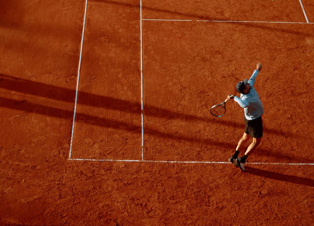
We built a red-black visual system, wide product crops and a direct voice built around rhythm, control and confidence.
Execution
The scope covered a key visual, campaign sections, a horizontal work rail and a component system the team can compose without a designer.
Result
The launch shortened the path to product and gave the brand a distinct visual code ready for future campaigns.